Everything you want to know about Gantt charts
Activities.
Time.
A Gantt chart in its most simple terms.
More specifically, a Gantt chart is a bar chart that shows a project schedule over a specific time.
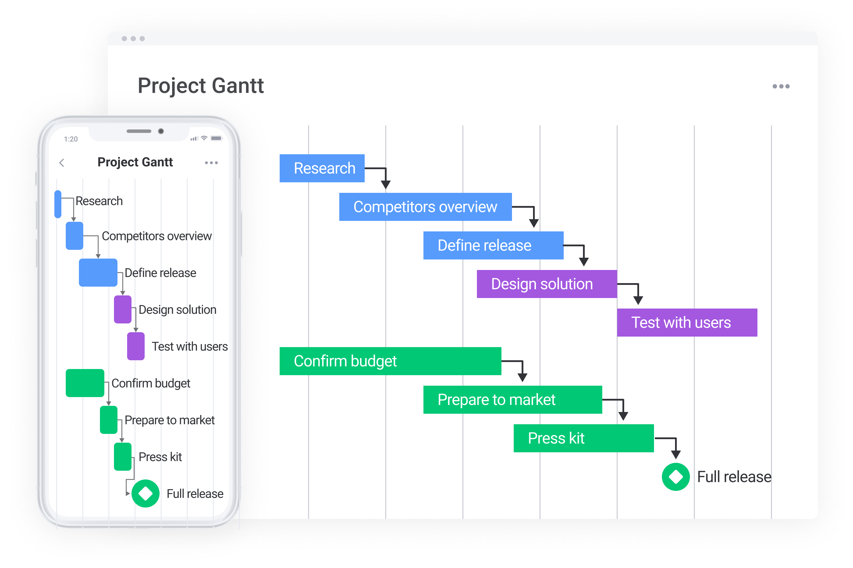
Modern Gantt charts tend to have dependencies (how each task connects to others). They can include multiple team members, color-coded tasks, calendars, and more.
But how did the Gantt chart earn its name and fame?
Where did the Gantt chart come from? A brief history
In 1896, a gentleman by the name of Karol Adamiecki invented a new way to show interdependent processes. He called this type of visual project management diagram a harmonogram or harmonograf — a precursor to what is now widely known as the Gantt chart.
So why isn’t it called the Adamiecki chart?
Unfortunately for Adamiecki, his original work didn’t get a lot of international recognition because he published it in Polish and Russian, two non-English languages. When he published a more detailed and widespread report in 1931, Henry Gantt’s chart had been circulating for a few decades.
Sorry, Karol.
Enter, Henry Gantt.
Mr. Gantt was a trained mechanical engineer who earned a Masters of Engineering degree in the late 1800s. In the early 1901s, he designed a bar chart (aka a harmonogram) to illustrate a project schedule.
Originally done by hand (no computers or Internet in the early 20th century!), it was painstakingly time-consuming and inefficient anytime the project changed as the chart had to be manually recreated.
Henry Gantt’s bar chart is now referred to as the Gantt chart.
The Gantt chart was used by the United States during WWI but didn’t become mainstream in business processes until personal computers became more commonplace in the 1980s.
The growth of the Internet in the 1990s led to further developments with Gantt charts and, by the end of the millennium, the Gantt chart was one of the most used project management tools on the market.
How are Gantt charts used today?
Gone are days of hand-drawn Gantt charts. It’s no longer necessary to recreate a new Gantt chart every time there is a small change.
Instead, project management software enables businesses to quickly and efficiently track a team’s project progress.
Modern Gantt charts (like monday.com’s) empower users to create boards, add tasks, assign team members, and easily visualize the entire project’s progress from A to Z.
Powerful Gantt charts have built-in automations that notify users when tasks are ready to move to the next phase and include alerts when a project is stuck.
You would be hard-pressed to find a 21st-century company that doesn’t implement some sort of a Gantt chart daily to manage projects. From education to marketing to IT, Gantt charts serve as the foundation for project managers and their teams.
Let’s dig into the components of modern-day Gantt charts.
What are the key components of a Gantt chart?
While no two Gantt charts look the same, every chart shows the same foundation — an X and Y-axis:
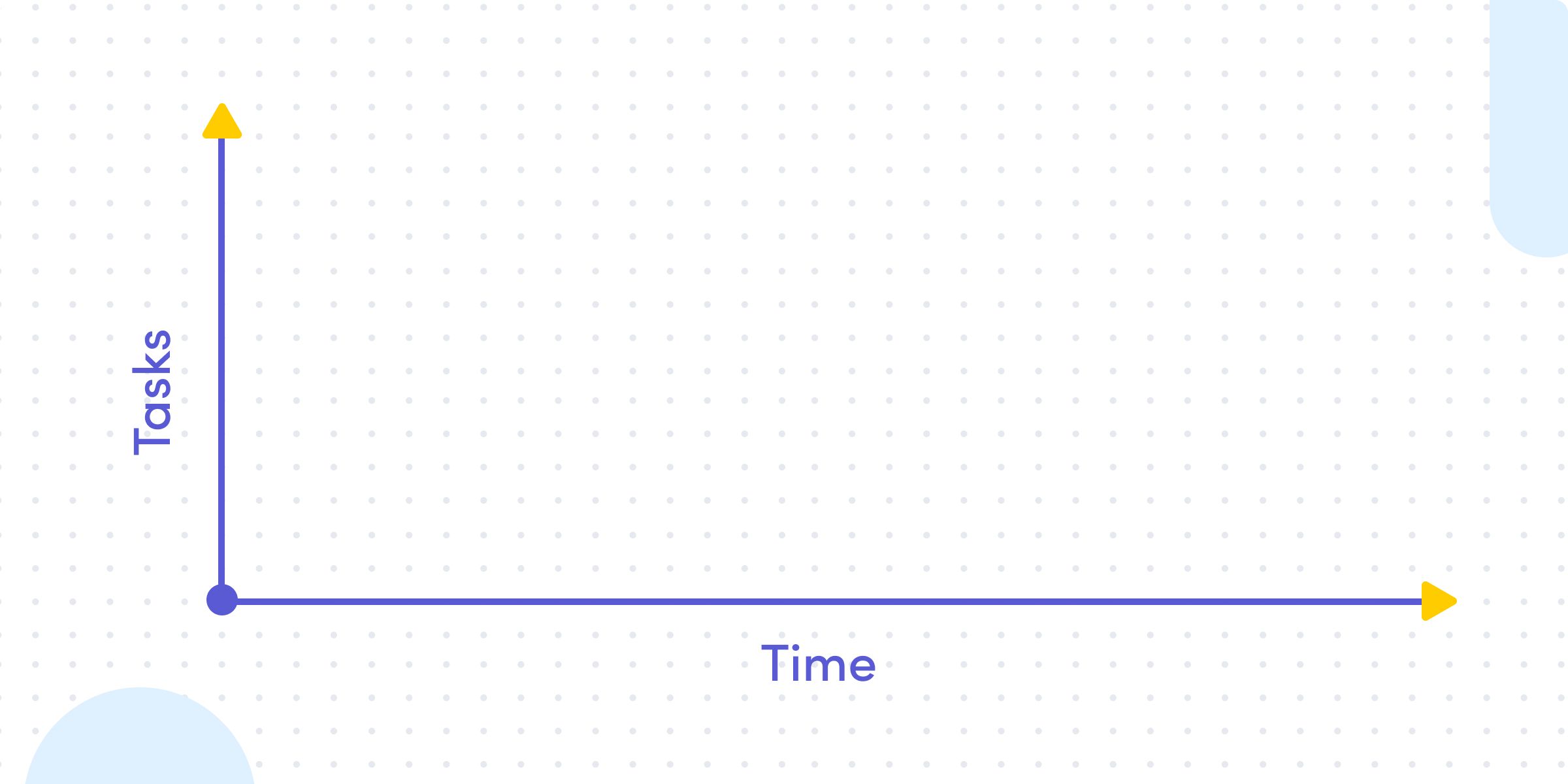
From there, the Gantt chart can get more sophisticated — and more powerful. Let’s break down a few of the critical components:
- Time: the date and duration of each task is often displayed in days/weeks/months, but it can also be represented in minutes/hours. The current day/time is usually highlighted. P.S., the length of each rectangle tells you how long a task is expected to take, known as the duration of the task. These show start and end dates.
- Tasks: there are individual activities (or tasks) that live at various stages of completion. Each task can stand on its own, yet can also be part of a larger bucket of tasks (think: groups and subgroups).
- Owner: this represents the person responsible for the task. Note: This can be more than one person or an entire team.
- Status: each task moves through various stages until completion. The status represents what stage each task currently resides in. Common statuses can include “up next,” “planned,” “stuck,” “future steps,” “milestone,” and so on.
- Milestones: the overarching tasks that don’t have a duration, and generally mark the end of a certain part of a project. This is the date when the project is set to be complete (aka, end date). For example, if your project consists of 5 phases, you might set a milestone to complete at the end of each phase.
- Dependencies: the last major component of Gantt charts is dependencies, which are often represented as arrows that link two tasks together. Many tasks cannot start until another task is completed.*
*At monday.com we are not fans of bottlenecks (truthfully, who is?). Dependencies have a tendency to create bottlenecks. Waiting on other people to finish their work means you can’t move forward. We encourage teams to push forward and prevent dependencies by working in parallel whenever possible.
More on dependencies…teams’ inability to manage task dependencies accounts for up to 12% of project failures, so it’s vital for project managers to be prepared and handle delays effectively.
It’s not unusual for projects to consist of multiple tasks that are being undertaken at the same time. However, Gantt charts nowadays do have the ability to display tasks that may be being completed simultaneously.
This is why we created monday.com with a Gantt Chart view focused on people, not tasks. Our Gantt Chart has powerful features for expert PMs, yet easy enough to grasp for first-time managers.
How can I create a Gantt chart on monday.com?
Gantt charts are the preferred way to go for many projects, specifically project planning and execution. It is really simple to create your own. Plus we’ve gotten great feedback from real-time users.
- After signing up or logging into your account, create a new board and add all of your tasks.
- Add a ‘task timeline’ column to your board so every task is given a time period.
- Once you fill in all the information, go to ‘views’ and choose the Timeline or Gantt view.
Voilá! This will help you see your entire project’s timeline and see if any tasks overlap. You can then easily switch up the dates until your chart is ready-to-go.
Should I use Gantt charts?
Yes! No! Maybe!
It depends.
Why the indecisiveness, you ask? Well, as we outline in this article, we haven’t always been raving fans of these charts. It took us some time (and the addition of timeline) to move to the pro-Gantt chart side of the aisle.
This is why we understand that Gantt charts aren’t the solution for everyone in every situation.
Here are some advantages (and some disadvantages):
Gantt chart pros
- Simple, straightforward, visual representation of projects
- Clearly see project progress, in real-time
- Enables the entire team to be on the same page
- Easily anticipate (and celebrate) goal completion while also identifying “sticking points” and heading them off before projects stall
- Understand how tasks are connected
- Limit multiple platforms for project communications
Though Gantt charts come in handy for all the reasons we’ve just mentioned, there are still a few instances where using a Gantt chart isn’t the smartest idea.
One such situation is where projects are extremely complex, as your Gantt chart can very quickly get out of hand.
When this happens, you’re no longer able to see the forest for the trees, and it starts to defeat the purpose of using a Gantt chart in the first place!
Gantt chart cons
- Can be challenging to understand the full complexity of a project
- Without built-in automation, management can get tricky
- Larger projects can quickly get unruly — lots of vertical and horizontal scrolling
- Dependencies. See our take in the previous section.
Gantt charts also tend to be ineffective when you’re trying to determine the scope and cost of a project, as the tasks you’re setting don’t necessarily correlate to a dollar value. So, you’re better off using a different method if you’re still costing out a project.
The last situation Gantt charts are not the best choice is when you need to print them.
PMs who’ve been in the game for a while will know this truth: there’s always at least one stakeholder who prefers paper and wants you to print the chart out. And it’s never pretty.
This is especially true for projects that span a significant length of time (we’re talking six months plus) because they usually don’t fit on a single page.
The main benefit in Gantt Charts is that projects morph and develop as they progress (don’t we know it?). Being able to easily move things around with click and drag functionality and having your chart and its task dependencies instantly updated is somewhat of a godsend.
Generally, we believe the pros outweigh the cons — and the right Gantt chart software should make your life easier — but certainly consider all options before moving forward.
Frequently asked questions:
As a manager, what should I know about Gantt charts?
1. Remember that people are adaptable so you should be too
Making big plans is a must for successful long-term projects, but it’s important to remember that people are unpredictable. They can get sick or have conflicting priorities which shift deadlines and deliverables. In many traditional Gantt charts, such unexpected changes can throw off a slew of project dependencies, but as long as your Gantt chart system is flexible, you can lay out all of your project and team plans easily and adjust as you need.
2. If it’s not pretty, people won’t use it
There is a reason Gantt charts rose in popularity the way they did— most people understand concepts and plans best through visuals. The Gantt chart was considered revolutionary when it was first created by mechanical engineer Henry Gantt in the 1910s to assist in building the Hoover Dam. It rose in popularity because of its ability to help people visualize when a project begins and ends, and the larger scope of long-term projects. In summary? Visual deadlines—good. Simple UI—good. Successfully building the Hoover Dam—good. But no matter how functional something is, when you’re managing a team and the success of the system depends on people’s adoption, if it’s not nice to use it’s not going to work.
3. Gantt charts should work for you, not the other way around
If you currently manage your team with Gantt charts and you feel like half of your work is maintaining your systems so everyone is on the same page, you are not alone. That’s why every Gantt system needs to have automations in place that can take some of the tedious work off of you and your team’s plate. Let’s say your team is working on a project that involves multiple dependent projects, across teams, and your approval is needed intermittently throughout the process. Keeping eyes on all of those processes to ensure you don’t become the bottleneck can be a full-time job. But if your Gantt chart lives within the Work OS that your team is using for all of its other workflows, you can easily set up reminders and automations to make project pass off as smooth as possible.
4. Workload should be managed in parallel
We already mentioned that Gantt charts were originally used for industrial projects, but there are ways to incorporate resource management to make sure you are distributing work evenly across your team. With a visual and flexible workload functionality, it’s easy to shift and reassign work while abiding by your long-term project goals.
When should I use Gantt charts?
1. Planning out your workflow
A large chunk of us find it a lot easier to understand a project’s scope and requirements when we can see it visually, and Gantt charts are an excellent way to provide a visual representation of your project.
Once you layout your project on paper (read: screen), you’ll be able to clearly see which tasks are dependent on others, which tasks need to take priority, and where each team member’s main area of focus needs to be at each stage of the project.
2. Determining your project’s critical path
The critical path method is an approach used by project managers to determine the longest sequence of tasks that must be completed for the project to be a success.
Gantt charts are a PM’s best friend for determining the critical path, as they allow you to quickly visualize which tasks are auxiliary, which are most critical, and which of all tasks are most vital to the delivery of a project happening on time.
Using a Gantt chart to understand a project’s critical path means project managers can more easily estimate how long a project will take, and therefore, more accurately report on project progress as tasks are completed.
3. Interpreting and setting task deadlines
Once you know a project’s critical path, you’ll need to set some deadlines for each individual task.
Because of a Gantt chart’s ability to clearly display task dependencies, they are a great help for interpreting and setting deadlines so that you aren’t delaying a project timeline due to a single uncompleted task.
Having a clear view of the project timeline and any necessary deadlines also helps project managers to report back to superiors and stakeholders accurately.
Are there alternatives to Gantt charts?
While the Gantt chart is the gold standard of project management software, there certainly are other solutions that businesses prefer. Note that all of the below examples have some similar components to the traditional Gantt chart.
PERT
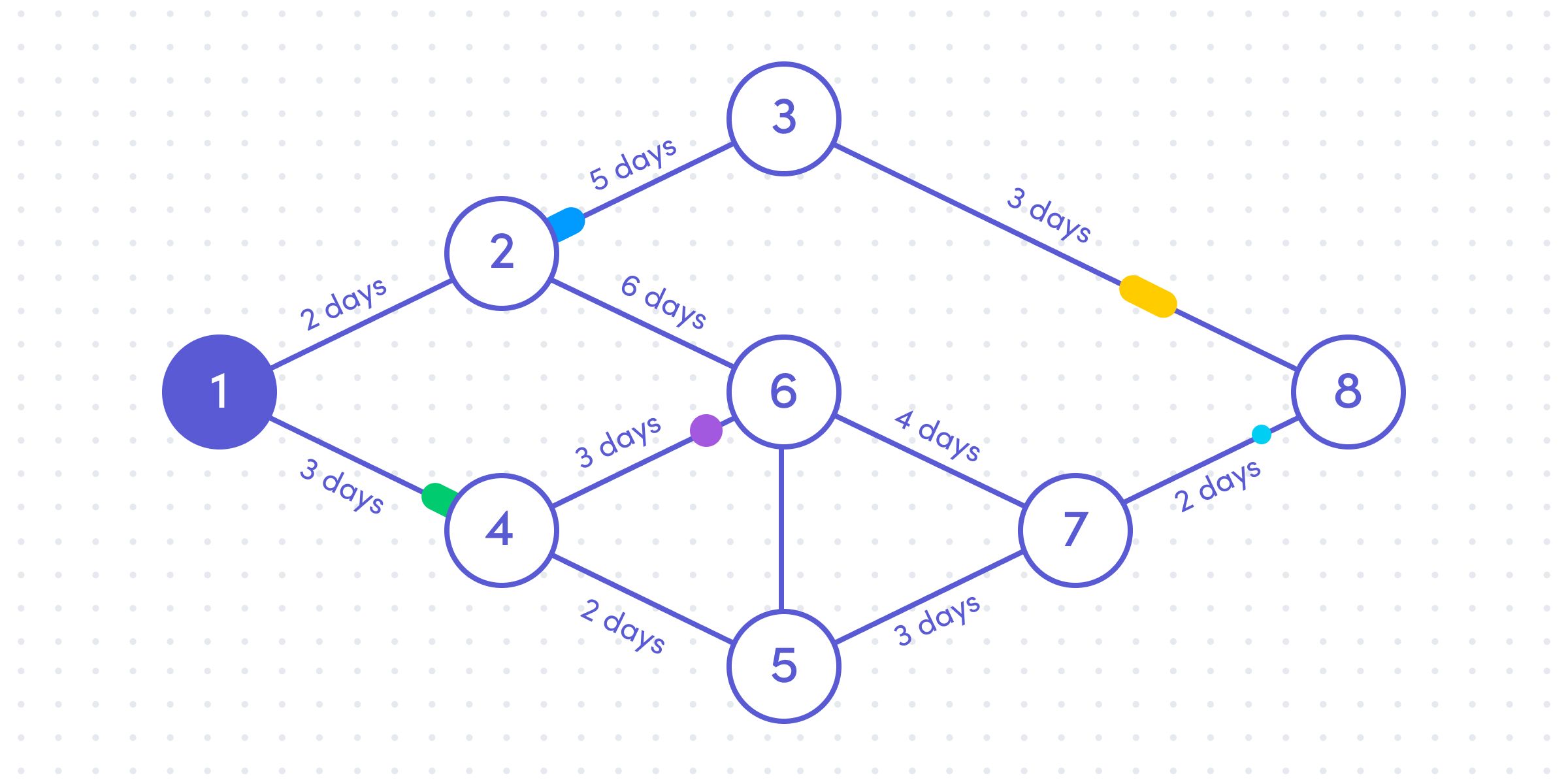
While a PERT (Program Evaluation Review Technique) is also a visual representation of a project, it is represented more like a network diagram. Instead of bars and dates, a PERT chart uses lines to connect nodes (often depicted by circles and rectangles). PERTs tend to be used more for larger-scale projects that require a high-level plan. Its goal is more focused on dependencies than on time to complete.
Kanban
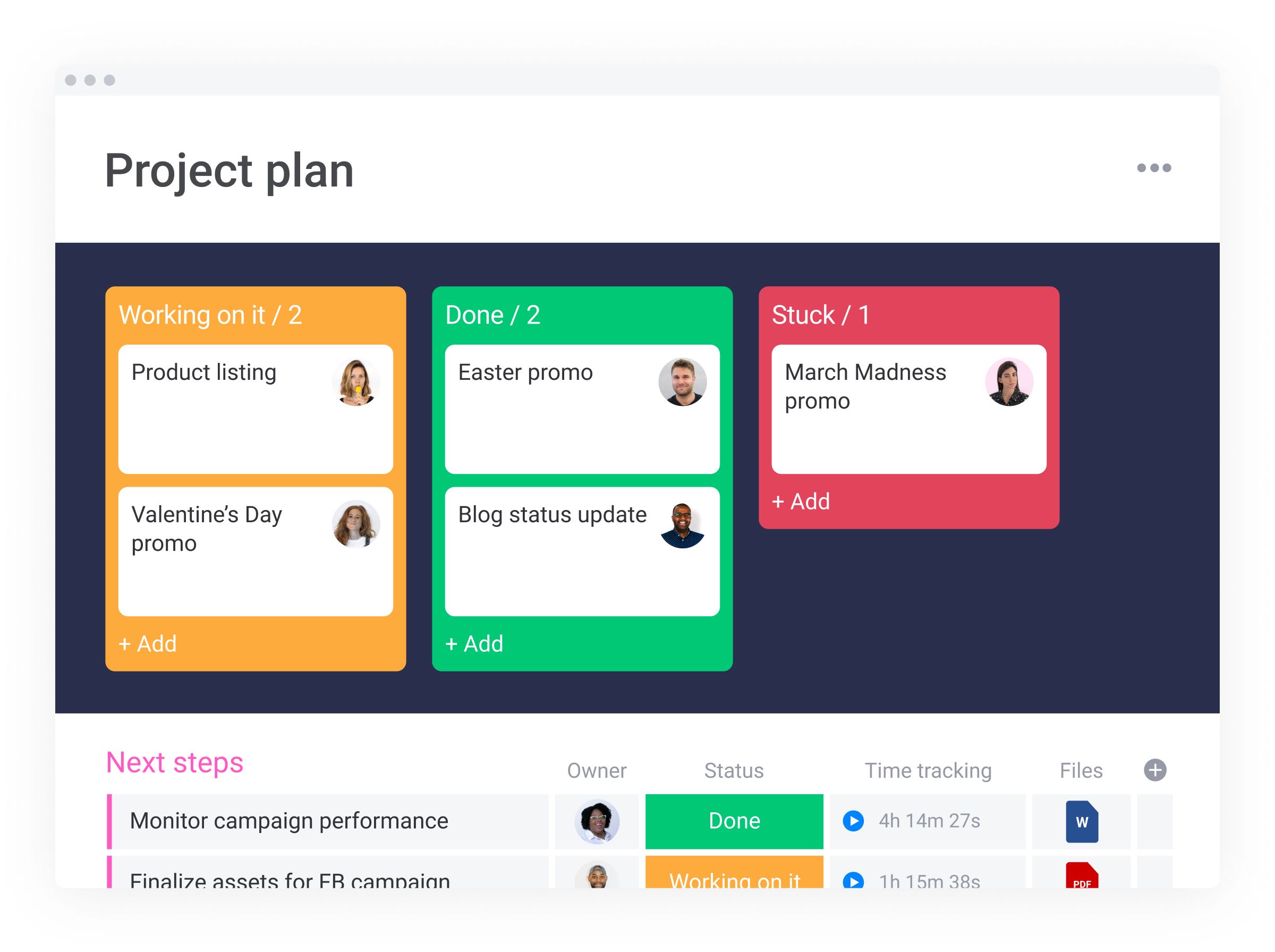
Kanban boards are comprised of 3 (sometimes 4) columns — To Do, Doing, Done. Cards (tasks) live under each column heading. One of the main advantages of a Kanban board is its simplicity. However, this can also be a drawback. Kanban boards are good at showing task status.
Note:
monday.com Kanban boards have more (and somewhat different) columns than the “To Do,” “Doing,” and “Done” outlined above. Our boards are fully-customizable. Make ‘em your own!
Timelines
Timelines are generally comprised of a single line and are reserved for more simple, high-level project overviews. Timelines can show dates and events, but fall apart when you start to add more complex dependencies.
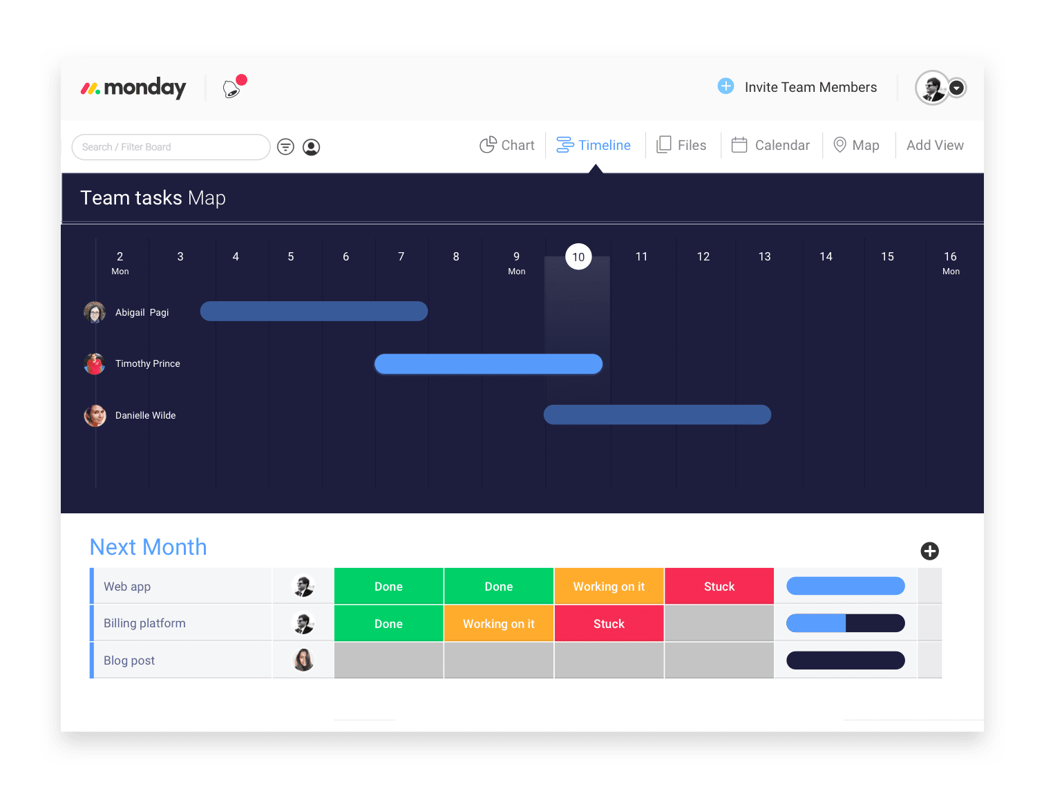
Note: Timelines can be part of a more complete Gantt chart — super flexible, intuitive, and focused on people.
Task lists
A task (or “to do”) list is the most simplistic of project software tools. Add tasks. Mark them as complete when done. While “checking something off your list” can be empowering, a basic task list lacks the true power of a detailed Gantt chart.
How do WBS and agile fit with Gantt charts?
Work breakdown structure, or WBS, is a specific method of breaking down large or complicated goals into manageable objectives. WBS does not factor in time to completion. For more details, check out our quick start guide.
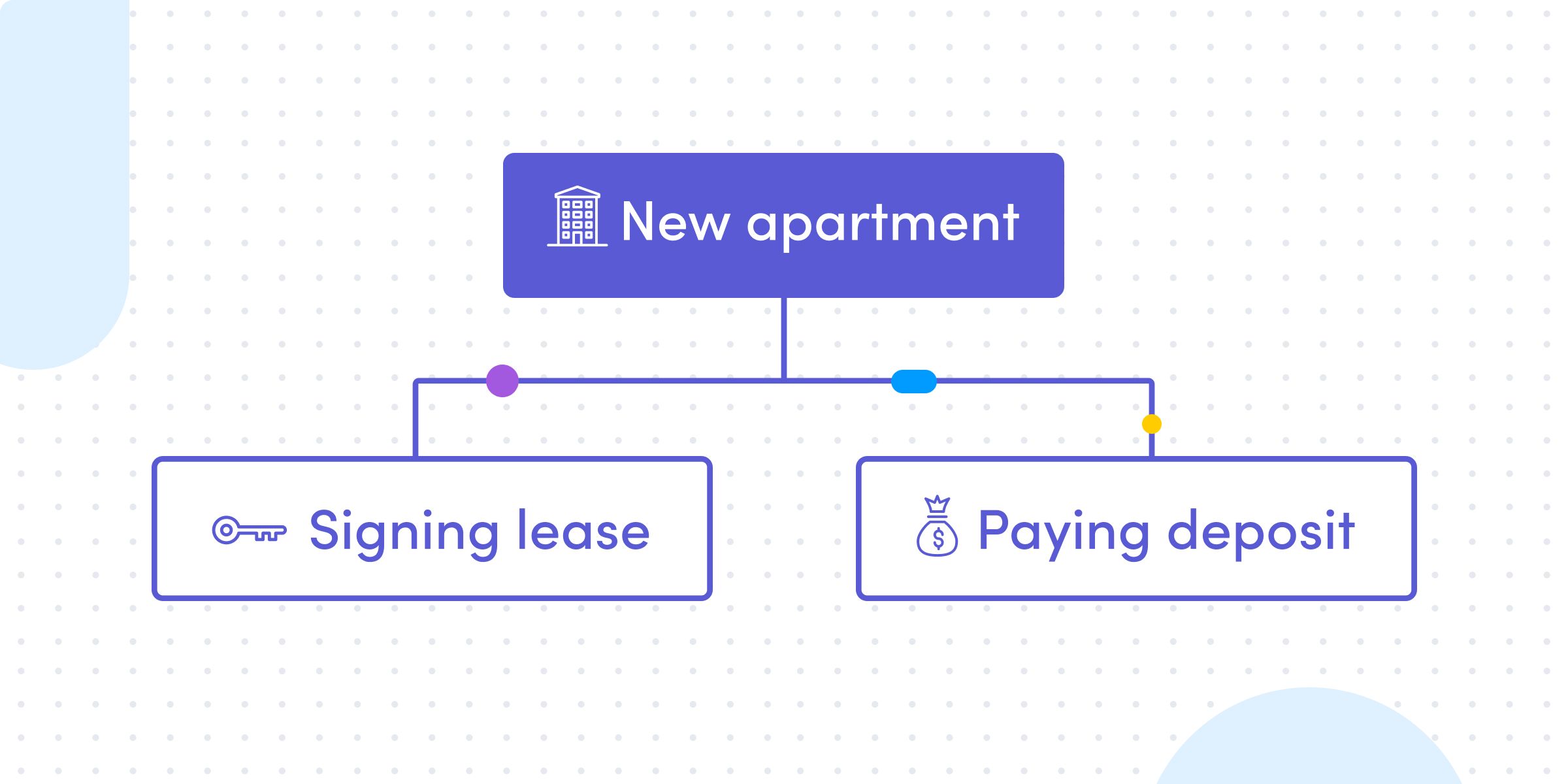
WBS is often the foundation for creating a solid Gantt chart. It depicts what tasks (and subtasks) are to be completed, but it does not show when each task will begin and end.
Start with a hierarchical representation of tasks and their dependencies (WBS) and layer in Gantt chart components such as time, ownership, status, milestones, etc.
Agile or Agile project management is a project management methodology comprised of short (1-3 week) sprints or iterations, where a team is hyperfocused on a small set of items that need to be completed during that time-window.
You can easily incorporate the agile process into any Gantt chart. In fact, we’ve shared the 11 steps to implement Agile Project Management into your workflow.
How do I decide on a Gantt chart software?
Google “gantt chart templates” and you get about 2,940,000 results.
Google “gantt chart software” and you get over 10 million results.
Clearly, there is no shortage of articles about Gantt chart templates and software. You don’t have to look far to find a free (or paid) Gantt chart template and solutions.
If you wanted, you could even skip the templates and software and build a quick Gantt chart in Google sheets or Excel.
But not all Gantt chart templates and software solutions are created equal.
The basic ones are, well, basic. Stand-alone. Limited functionality. No automation. Zero dependencies. (In some cases, too many dependencies). No internal communication and collaboration.
The more sophisticated Gantt chart template and software solutions solve for most of the known “Gantt chart issues:”
- Different chart views: change the way you see data
- Customizable automations and integrations: notify everyone about progress
- Filter and sort data or search with toolbar: no more endless scrolling
- Eliminate dependencies – see what teammates are working on and add tasks in conjunction
So if you are looking for a visual solution that can manage projects of all sizes and industries…check out our Gantt chart:
This blog was originally posted on monday.com on ‘Everything you want to know about Gantt Charts‘